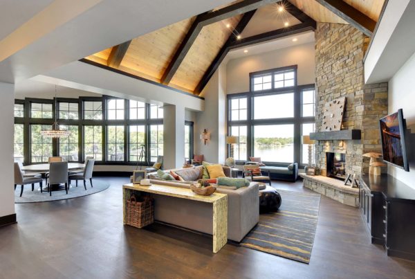
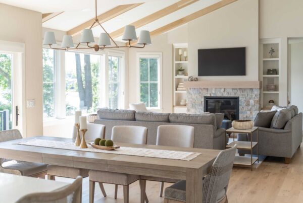
Is your kitchen ready for a refresh? A change in paint color can make a dramatic impact. In 2026, the trending kitchen paint colors will lean into warm, grounded palettes paired with clean lines and natural textures, notes Ashley Mock, Design & Project Development for Highmark Builders. “We’re seeing a shift from stark whites to creamy off-whites, putty beiges, warm taupes, and desaturated earth tones,” she says.
Shifting your kitchen from dated to timeless or from quiet to dramatic can all be done with a paintbrush and the perfect color. But there’s much more to selecting kitchen paint than just grabbing a few supplies.
How Wall Color Is Influenced by Floors, Cabinets, and Counters
Choosing paint for your kitchen can be a daunting task. You might start by combing through thousands of paint swatches and narrowing down your selection to a few. But don’t make any decisions at this point. Take those swatches home and analyze them next to every kitchen surface—from flooring to countertops—because each will affect how a color reads once it’s on the wall.
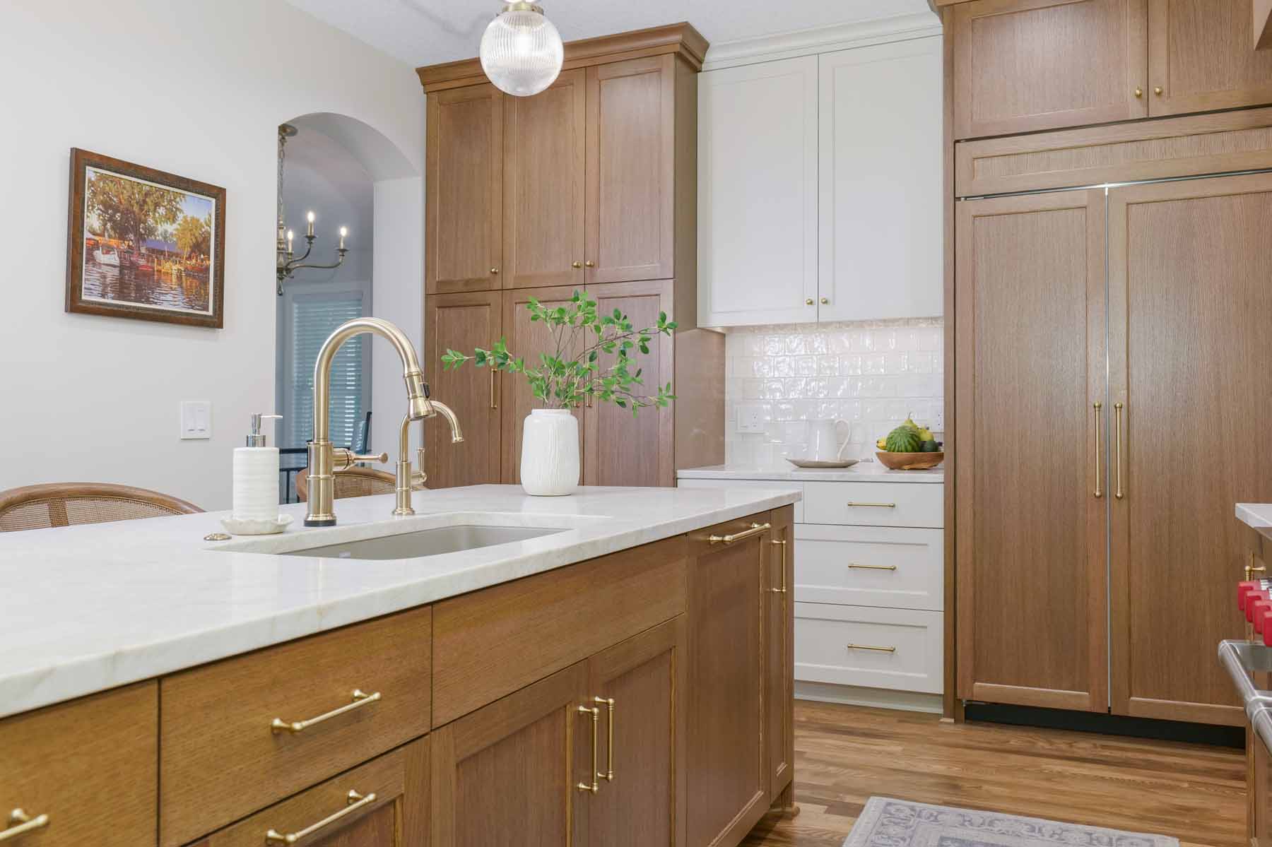
“Wall color is really the supporting actor in a kitchen,” says Ashley, an interior designer and luxury remodel expert. “Its job is to connect all the fixed elements. Cabinet finish, countertop veining, and flooring undertones determine the temperature and depth that will look right on the walls.”
Here’s how each element in your kitchen can affect color:
- Flooring: Warm wood floors will pull the warmer undertones out of paint. If you have cooler flooring materials such as concrete or gray tile, those same paint swatches might appear cooler or more muted.
- Cabinets: Dark cabinets can make lighter walls pop, while light or white cabinets can handle deeper, richer wall tones. For example, a smoky jade wall can look stunning next to white or cream cabinetry.
- Countertops and Backsplash: Veins or speckles in a countertop can emphasize certain undertones. For example, a white marble with cool gray veins might give a greenish tone to certain beige paint colors.
- Hardware and Fixtures: Even metals can subtly shift how paint color feels in a room. Brass or copper fixtures warm up a space, while chrome and stainless steel cool it down.
PRO TIP: Before committing, paint at least two 12-inch test squares directly on the wall beside cabinets and flooring, and check them in morning, afternoon, and evening light.
If you can’t find the right paint swatch to coordinate with your existing kitchen, the problem may be bigger that just color. Evaluate each element—cabinets, flooring, countertops, and fixtures—to determine if one or all needs to be replaced to achieve the look you want.
Understanding Color Undertones: Cool vs. Warm
If you’ve ever worked with an interior designer, you may have heard them mention undertones—the subtle color beneath the surface hue that determines how warm or cool it looks. These undertones can dramatically affect the feel of a room. “Warm undertones show hints of yellow, red, or brown—these create a cozy, inviting feel. Cool undertones have traces of blue, green, or violet—these create a crisp, airy, more modern feel,” says Ashley.
Balancing these undertones with your fixtures and finishes is the key to an inviting kitchen. Warm undertones pair beautifully with natural wood and brass finishes. “Wood is making a strong comeback—especially natural walnut, rift-cut white oak, and darker espresso stains used in a modern way,” says Ashley. “Matte finishes and mixed metal accents, such as polished nickel paired with black or antique brass, continue to trend.”
On the cooler side, paint colors with blue, green, or gray undertones can make your kitchen feel airy and calm. “Color is still present but more muted—think stormy blues, eucalyptus greens, and moody charcoal rather than bold primaries,” says Ashley.

PRO TIP: Place your paint sample next to pure white trim. If it looks yellowish, it’s warm. If it leans blue or gray, it’s cool.
How to Select the Right Paint Color for Your Kitchen

Visualizing your ideal paint palette based on a swatch or paint sample is still a nerve-wracking process for the untrained eye. To ensure the color complements every finish in your kitchen, Ashley uses a tried-and-true method with each client. “My approach is very material-driven. I start with the elements that aren’t easily changed—cabinets, counters, backsplash, and flooring. Once those are confirmed, I guide clients toward paint colors that harmonize with those undertones,” she says. “We look at large samples in the actual kitchen, at different times of day, so clients can see how natural and artificial lighting plays with the color. Ultimately, the right color is the one that supports the design without competing with the star elements of the kitchen.”
If you have both warm and cool elements in your existing kitchen, paint can bring the two together. “If cabinets have a warm oak stain and your floors lean cool gray, the wall color needs to bridge the two so the space feels intentional rather than mismatched,” says Ashley.
Ready for a Kitchen Update?
Whether you’re planning a simple repaint or a full kitchen remodel, Highmark Builders can help you choose the perfect palette and coordinated finishes to bring your vision to life with expert craftsmanship and design expertise. Contact us today for a consultation to discuss the layout, colors and style that will make your kitchen the favorite room in your home.
Kitchen Paint Color Questionnaire
If you’re still unsure which direction to go, this questionnaire might help you decide:
1. Which best describes your decorating style?
☐ Classic and traditional
☐ Modern and minimalist
☐ Warm and rustic
☐ Eclectic and bold
2. How much natural light does your kitchen get?
☐ Lots of sunlight throughout the day
☐ Moderate, mostly indirect light
☐ Minimal or shaded light
3. What is your current cabinet color?
☐ White or light wood
☐ Medium wood tone
☐ Dark or painted color
4. Which best describes the mood you want for your kitchen?
☐ Bright, airy, and cheerful
☐ Cozy, warm, and inviting
☐ Bold, dramatic, and stylish
5. Which statement feels most like you?
☐ I love timeless, neutral tones that never go out of style.
☐ I enjoy subtle color that adds personality but stays elegant.
☐ I want my kitchen to stand out—I’m not afraid of deep or rich color.
Your results:
- Mostly As → Try soft neutrals like taupe, light khaki, or greige tones.
- Mostly Bs → Look for balanced greens or muted taupes.
- Mostly Cs → Experiment with deeper tones for statement walls or cabinetry.


For more kitchen inspiration, check out our kitchen design photo gallery.